[C# WPF] 바인딩 #04 - 목록 기반의 컨트롤 바인딩
1. 목록 기반의 컨트롤
- ComboBox, ListBox, ListView, TreeView 컨트롤을 이용해서 바인딩 하는 방법
→ 다수의 목록을 가지고 작업을 하고, 목록에서 선택을 해서 그 결과를 다른 곳으로 넘기는 식의 UI가 대부분인 점 등 공통점이 많다.
- ItemsSource : 사용할 목록 설정 가능
- SelectedIndex : 목록 상에서 선택된 항목의 index (단순 목록 상에서 순서번호)를 반환 또는 설정 → ComboBox에서 -1로 설정하면 ComboBox에 아무것도 표시 되지 않는 미선택 상태가 된다.
- SelectedItem : 실제 선택된 항목 자체를 의미
예를들어 사람의 인적 사항을 기록하는 Person이라는 클래스를 이용해 People 이라는 목록을 만들었다면 SelectedItem은 특정 사람을 의미하게 됨. SelectedIndex의 경우 단순하게 몇 번째 사람 과 같은 식으로 된다. - SelectedValue : SelectedItem 중에서 특정 속성을 반환 또는 설정하는 속성
예) People 목록에서 특정 Person을 선택하면 Person의 이름, 나이와 같은 속성이 선택 - SelectesValuePath : SelectedValue를 사용하기 위해서 부가적으로 경로를 더 설정
예) SelectedValue 로 Person의 고등학교로 접근하고 싶다면 SelectedVAluePath에서는 고등학교 전 단계인 출신학교를 지정 해 줘야 하는 방식 - DisplayMemerPath : person으로 이루어진 People 이란느 목록을 표시하고자 할 때 표시되는 항목을 이름으로 할 것인지, 주소로 할 것인지 표시 될 속성을 지정할 수 있다.
ComboBox
◾ ComboBox 바인딩 - 목록정의
- 별도의 목록을 만들어 바인딩 처리를 하는 예제
    public partial class MainWindow : Window
    {

        private List<PersonInfo> persons = new List<PersonInfo>();

        public List<PersonInfo> Persons
        { get { return persons; }
          set { persons = value; }
        }
    ...
→ persons라는 List 타입의 목록을 하나 만들어준다.
ItemSource를 바인딩하기 위해서 Persons라는 속성을 따로 정의
List가 아닌 목록 형태로 나올 수 있는 아무 클래스나 사용 가능 ( ex. ObservableCollection, Dictionary 등)
→ List를 사용해서 ItemSource를 바인딩하면 내부 목록이 갱신될 때, UI상 반영이 되지 않기 떄문에 아이템이 추가/제거 되는 것을 자동 갱신 해 주는 BindingList를 사용하는 것이 좋다.
→ List 타입의 속성을 정의한 이유는 XAML 코드 상에서 바인딩을 하기 위해서인데, 이후 나오는 수동 바인딩에도 사용되기 때문인다.
ItemSource의 경우 버그로 인해 제대로 갱신이 되지 않는 문제가 간혹 발생하기 때문에 수동으로 지정 해 주는 것도 좋은 방법이다.
🔸 List와 BinfingList의 차이
→ XAML 코드를 만들어 Button을 누를 때 마다 목록에 아이템이 하나씩 추가되는 예제
→ List 로 만든 목록을 사용하면 목록에 추가는 되지만 UI상에 변화가 없다.
→ BindingList의 경우 제대로 갱신이 된다.
◾ ComboBox 바인딩 - 목록 데이터 만들기
      public MainWindow()
      {
          InitializeComponent();

          #region Data추가 부분
          persons.Add(new PersonInfo { Name = "Jung", Age = 0, Job = 1, Address = "Seoul", Married = true });
          persons.Add(new PersonInfo { Name = "Park", Age = 3, Job = 0, Address = "Busan", Married = false });
          persons.Add(new PersonInfo { Name = "Jo", Age = 2, Job = 2, Address = "Daegue", Married = false });
          persons.Add(new PersonInfo { Name = "choi", Age = 1, Job = 1, Address = "Gwangjoo", Married = false });
          persons.Add(new PersonInfo { Name = "Uh", Age = 2, Job = 2, Address = "Daejon", Married = true });

}- 사용할 데이터를 MainWindow 생성자 부분에 추가 해 준다.
◾ ComboBox 바인딩 - UI만들기 - 상단에 ComboBox를 추가해준다.
ComboBox에 CS 파일에서 만든 Persons목록이 표시되고, 특정 항목을 선택하면 선택된 사람의 정보가 밑 컨트롤에 표시되는 UI
<Window x:Class="WpfApp1.MainWindow"
        xmlns="http://schemas.microsoft.com/winfx/2006/xaml/presentation"
        xmlns:x="http://schemas.microsoft.com/winfx/2006/xaml"
        xmlns:d="http://schemas.microsoft.com/expression/blend/2008"
        xmlns:mc="http://schemas.openxmlformats.org/markup-compatibility/2006"
        xmlns:local ="clr-namespace:WpfApp1"
        mc:Ignorable="d"
        Title="Window"
        SizeToContent="WidthAndHeight" Name="mainWindow"
        >

    <Grid Height="180" Width="180">
        <Grid.RowDefinitions>
            <RowDefinition Height="26" />
            <RowDefinition />
        </Grid.RowDefinitions>

      <!-- ComboBox에 별도로 이름을 저장해야만 이후 바인딩하거나
           CS 파일에서 수동으로 ItemSource를 지정 가능하므로
           Name속성을 반드시 지정해야함 -->
        <ComboBox Grid.Row="0" Name="seletCombo" Margin="3" />

        <GroupBox Grid.Row="1">
            <Grid>
                <Grid.ColumnDefinitions>
                <ColumnDefinition />
                <ColumnDefinition />
            </Grid.ColumnDefinitions>
            <Grid.RowDefinitions>
                <RowDefinition/>
                <RowDefinition/>
                <RowDefinition/>
                <RowDefinition/>
                <RowDefinition/>
                <RowDefinition/>
            </Grid.RowDefinitions>

            <TextBlock Grid.Column="0" Grid.Row="0"
                     Text="Name" Margin="3" VerticalAlignment="Center" />
            <TextBlock Grid.Column="0" Grid.Row="1"
                     Text="Age" Margin="3" VerticalAlignment="Center" />
            <TextBlock Grid.Column="0" Grid.Row="2" Text="Address" Margin="3" VerticalAlignment="Center" />
            <TextBlock Grid.Column="0" Grid.Row="3" Text="Job" Margin="3" VerticalAlignment="Center" />
            <TextBlock Grid.Column="0" Grid.Row="4" Text="Married" Margin="3" VerticalAlignment="Center" />

            <TextBox Grid.Column="1" Grid.Row="0"
                    Text="{Binding Path=Name}" Margin="3" />
            <ComboBox Grid.Column="1" Grid.Row="1"
                      SelectedIndex="{Binding Path=Age}" Margin="3" >
                <ComboBoxItem>20~30</ComboBoxItem>
                <ComboBoxItem>30~40</ComboBoxItem>
                <ComboBoxItem>40~50</ComboBoxItem>
                <ComboBoxItem>50~</ComboBoxItem>
            </ComboBox>
            <TextBox Grid.Column="1" Grid.Row="2"
                    Text="{Binding Path=Address}" Margin="3" />
            <ComboBox Grid.Column="1" Grid.Row="3"
                     SelectedIndex="{Binding Path=Job}" Margin="3">
                <ComboBoxItem>Engineer</ComboBoxItem>
                <ComboBoxItem>Teacher</ComboBoxItem>
                <ComboBoxItem>Doctor</ComboBoxItem>

            </ComboBox>
            <CheckBox Grid.Column="1" Grid.Row="4" Margin="3"
                      IsChecked="{Binding Path=Married}" VerticalAlignment="Center"/>

            <Button Grid.Column="0" Grid.Row="5" Content="change" Margin="3" VerticalAlignment="Center" Click="Button_Click_1"/>
            <Button Grid.Column="1" Grid.Row="5" Content="Save" Margin="3" VerticalAlignment="Center" Click="Button_Click"/>
            </Grid>
        </GroupBox>
    </Grid>

</Window>
◾ ComboBox 바인딩 - ItemsSource 바인딩
- CS파일에서 만들어준 Persons목록을 ComboBox의 ItemsSource 로 넣어준다.
🔸 수동 방식
- CS 파일에서 특정 위치에 ComboBox의 Name을 이용해서 목록을 직접 지정
- 목록이 변경 될 때마다 동일한 작업을 해 줘야하지만 버그 없는 확실항 방법
- ItemsSource를 CS파일에서 지정 할 때에는 selectCombo.ItemsSource = null 과 같이 한번 null로 만든 뒤 목록을 지정하는 것이 좋다.
        public MainWindow()
        {
            InitializeComponent();

            #region Data추가 부분
            persons.Add(new PersonInfo { Name = "Jung", Age = 0, Job = 1, Address = "Seoul", Married = true });
            persons.Add(new PersonInfo { Name = "Park", Age = 3, Job = 0, Address = "Busan", Married = false });
            persons.Add(new PersonInfo { Name = "Jo", Age = 2, Job = 2, Address = "Daegue", Married = false });
            persons.Add(new PersonInfo { Name = "choi", Age = 1, Job = 1, Address = "Gwangjoo", Married = false });
            persons.Add(new PersonInfo { Name = "Uh", Age = 2, Job = 2, Address = "Daejon", Married = true });

  			// 목록을 직접 지정
            seletCombo.ItemsSource = persons;

              #endregion
🔸 바인딩(자동) 방식
    <Grid Height="180" Width="180">
        <Grid.RowDefinitions>
            <RowDefinition Height="26" />
            <RowDefinition />
        </Grid.RowDefinitions>

        <ComboBox Grid.Row="0" Name="seletCombo" Margin="3" ItemsSource="{Binding Path=Persons}" />

        <GroupBox Grid.Row="1">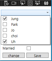
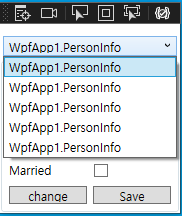
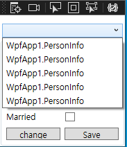
- ComboBox 목록 아이템인 PErsonsInfo 클래스명이 표기된다.
목록의 개수가 5개로 CS파일에서 만들어준 목록의 크기와 동일한 것만 확인하고 넘어간다.
◾ ComboBox 바인딩 - ItemTemplate 활용법
- item명이 클래스 명칭으로 뜨는 것을 해결하기 위해서는 ItemTemplate을 정의해주어야 한다.
        <ComboBox Grid.Row="0" Name="seletCombo" Margin="3" ItemsSource="{Binding Path=Persons}">
            <ComboBox.ItemTemplate>
                <DataTemplate>

                </DataTemplate>
            </ComboBox.ItemTemplate>
        </ComboBox>
→ 콤보박스 하위태그로 ComboBox.ItemTemplate을 만들어 주면 하위에 DataTemplate 태그를 추가 할 수 있으며 DataTemplate 하위에는 WPF에서 사용 가능한 모든 컨트롤을 사용할 수 있다.
즉, WPF 컨트롤들을 이용해 ComboBox의 개별 Item을 표시하는 형태를 만들 수 있는 것.
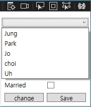
→ 단순하게 ComboBox에 이름이 표시되기를 원하기 때문에 간단하게 문자를 표시하는 컨트롤인 TextBlock을 추가해서 바인딩을 얼어주면 된다.
→ ItemTemplate에서 이미 PersonInfo 클래스에 접근한 상태이므로 표시할 항목을 바인딩 할 때에도 PersonInfo의 속성인 Name만 적어주면 된다.
(ComboBox에는 ItemsSource로 목록이 지정됐지만 개별 Item은 PersonInfo 클래스가 되기 때문에 ItemTemplate에서 이미 PersonInfo 클래스에 접근한 상태)
        <ComboBox Grid.Row="0" Name="seletCombo" Margin="3">
            <ComboBox.ItemTemplate>
                <DataTemplate>
                    <TextBlock Text="{Binding Path=Name}"/>
                </DataTemplate>
            </ComboBox.ItemTemplate>
        </ComboBox>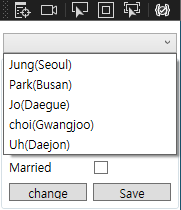
◾ ComboBox 바인딩 - 리소스를 이용한 ItemTemplate 정의
- 원하는 부분에 Resource 태그를 정의하고 하위에 DataTemplate 리소스를 동일하게 만들고 키를 정의해준다. 마지막으로 리소스를 사용할 부부인 ComboBox 태그의 ItemTmeplate에 정의된 키를 이용해서 리소스를 정의해주면 된다.
    <!-- 리소스 태그 정의 -->
    <Window.Resources>
        <DataTemplate x:Key="comboboxitem">
            <TextBlock Text="{Binding Path=Name}"/>
        </DataTemplate>
    </Window.Resources>

    <Grid Height="180" Width="180">
        <Grid.RowDefinitions>
            <RowDefinition Height="26" />
            <RowDefinition />
        </Grid.RowDefinitions>

        <!-- 정의된 키를 이용해 리소스 지정 -->
        <ComboBox Grid.Row="0" Name="seletCombo" Margin="3" ItemTemplate="{StaticResource comboboxitem}"/>
◾ ComboBox 바인딩 - 멀티바인딩
- 다양한 모양의 Template 을 만들 수 있다.
    <!-- 복잡한 ItemTemplate 만들기 -->
    <Window.Resources>
        <DataTemplate x:Key="comboboxitem">
            <Grid>
                <Grid.ColumnDefinitions>
                    <ColumnDefinition Width="30"/>
                    <ColumnDefinition />
                </Grid.ColumnDefinitions>
                <CheckBox Grid.Column="0" IsChecked="{Binding Path=Married}"/>
                <TextBlock Grid.Column="1" Text="{Binding Path=Name}" />
            </Grid>
        </DataTemplate>
    </Window.Resources>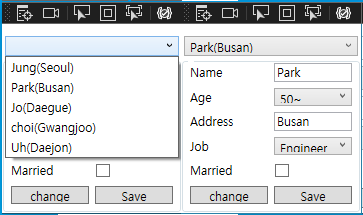
→ Grid를 이용해 CheckBox에 Married라는 속성을 바인딩 시키고 TextBlock에 Name을 바인딩 시켜 실행해보면 Item에 CheckBox와 TextBlock이 동시에 표시된다.
...
          <!-- 리소스 태그 정의 -->
    <Window.Resources>
        <local:ComboItemConverter x:Key="ComboItemConverter"/>
        <DataTemplate x:Key="comboboxitem">
            <TextBlock>
                <TextBlock.Text>
                    <MultiBinding Converter="{StaticResource ComboItemConverter}">
                        <Binding Path="Name"/>
                        <Binding Path="Address"/>
                     </MultiBinding>
                </TextBlock.Text>
            </TextBlock>
        </DataTemplate>
    </Window.Resources>
...
...
public class ComboItemConverter : IMultiValueConverter
{
#region IMultiValueConverter Members
#endregion
object IMultiValueConverter.Convert(object[] values, Type targetType, object parameter, CultureInfo culture)
{
string name = (string)values[0];
string add = (string)values[1];
return name + "(" + add + ")";
}
object[] IMultiValueConverter.ConvertBack(object value, Type[] targetTypes, object parameter, CultureInfo culture)
{
throw new NotImplementedException();
}
}
...
→ DataTemplate에 Grid를 두고 TextBlock 2개를 나란히 배치해 멀티바인딩을 이용하였다.
→ CS 파일에서 Name 만든 다음 XAML 파일에 Address값을 받아 묶어서 표시해주는 컨버터를 TextBlock의 Text에 적용해준다.
◾ ComboBox 바인딩 - SeletedItem 바인딩
- ComboBox에서 선택된 아이템을 바인딩해서 다른 컨트롤에서 사용하는 예제
특정 사함을 선택하면 그 사람에 대한 세부 정보가 ComboBox 하단의 컨트롤에 표시되는 예제
    <Grid Height="180" Width="180">
        <Grid.RowDefinitions>
            <RowDefinition Height="26" />
            <RowDefinition />
        </Grid.RowDefinitions>

        <!-- 정의된 키를 이용해 리소스 지정 -->
        <ComboBox Grid.Row="0" Name="seletCombo" Margin="3" ItemTemplate="{StaticResource comboboxitem}"/>
        <GroupBox Grid.Row="1">
            <Grid DataContext="{Binding ElementName=seletCombo, Path=SelectedItem}">
                <Grid.ColumnDefinitions>
                <ColumnDefinition />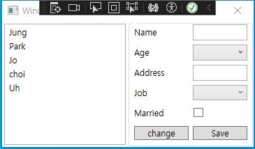
→ DataContext로 ComboBox의 SelectedItem을 지정해줘서 이하 컨트롤에서 SelectedItem에 접근 가능하도록 함
ComboBox의 Item은 PersonInfo 이므로 SeletedItem 또한 PersonInfo이고 DataContext가 지정된 태그 그 이하의 컨트롤에서는 PersonInfo의 속성으로 바인딩 가능
ListBox
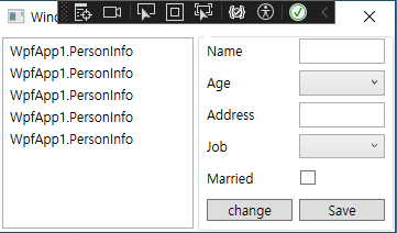
◾ ListBox 바인딩 - UI만들기
- ComboBox를 눌렀을 때 전체 목록이 표시된다는 점만 차이점이 있을 뿐 기본 동작은 ComboBox와 동일하다.
    <Grid Height="180" Width="360">
        <Grid.ColumnDefinitions>
            <ColumnDefinition />
            <ColumnDefinition />
        </Grid.ColumnDefinitions>

        <ListBox Name="listbox" Grid.Row="0" Margin="3"/>

        <!-- 정의된 키를 이용해 리소스 지정 -->

        <GroupBox Grid.Column="1">
            <Grid DataContext="{Binding ElementName=listbox, Path=SelectedItem}">
                <Grid.ColumnDefinitions>
                    <ColumnDefinition />
→ 최상위 Grid를 2개의 Column으로 정의해 ListBox를 위치시키고 우측에는 ComboBox예제를 동일하게 세부정보가 표시될 UI를 만들어준다.
        public MainWindow()
        {
            InitializeComponent();

            #region Data추가 부분
            persons.Add(new PersonInfo { Name = "Jung", Age = 0, Job = 1, Address = "Seoul", Married = true });
            persons.Add(new PersonInfo { Name = "Park", Age = 3, Job = 0, Address = "Busan", Married = false });
            persons.Add(new PersonInfo { Name = "Jo", Age = 2, Job = 2, Address = "Daegue", Married = false });
            persons.Add(new PersonInfo { Name = "choi", Age = 1, Job = 1, Address = "Gwangjoo", Married = false });
            persons.Add(new PersonInfo { Name = "Uh", Age = 2, Job = 2, Address = "Daejon", Married = true });

            listbox.ItemsSource = persons;

            #endregion
        }
→ cs파일에서도 comboBox 예제와 똑같이 목록을 하나 만들어주고 생성자에서 ListBox에 ItemsSource를 정의해준다.
XAML코드에서 ListBox에 ItemSource를 바인딩해도 무방하다.
🔸 방법1 - 리소스 등록
	...
        public MainWindow()
        {
            InitializeComponent();

            #region Data추가 부분
            persons.Add(new PersonInfo { Name = "Jung", Age = 0, Job = 1, Address = "Seoul", Married = true });
            persons.Add(new PersonInfo { Name = "Park", Age = 3, Job = 0, Address = "Busan", Married = false });
            persons.Add(new PersonInfo { Name = "Jo", Age = 2, Job = 2, Address = "Daegue", Married = false });
            persons.Add(new PersonInfo { Name = "choi", Age = 1, Job = 1, Address = "Gwangjoo", Married = false });
            persons.Add(new PersonInfo { Name = "Uh", Age = 2, Job = 2, Address = "Daejon", Married = true });

            listbox.ItemsSource = persons;

            #endregion
        }
	...
	...
    <Grid Height="180" Width="360">
        <Grid.ColumnDefinitions>
            <ColumnDefinition />
            <ColumnDefinition />
        </Grid.ColumnDefinitions>

        <ListBox Name="listbox" Grid.Row="0" Margin="3"
                 ItemTemplate="{StaticResource listteamplate}" />
	...
🔸 방법2 - Template 정의
      ...
        <ListBox Name="listbox" Grid.Row="0" Margin="3">
            <ListBox.ItemTemplate>
                <DataTemplate>
                    <TextBlock Text="{Binding Name}"/>

                </DataTemplate>
            </ListBox.ItemTemplate>
        </ListBox>
      ...
🔸 방법3 - DisplayMemberPath
- listBox에 한해서만 가능 → 다른 컨트롤에서는 아이템 클래스 이름이 표시 됨.
- 간단하게 속성만 표시하고자 할 때에 사용
      ...
       <Grid Height="180" Width="360">
        <Grid.ColumnDefinitions>
            <ColumnDefinition />
            <ColumnDefinition />
        </Grid.ColumnDefinitions>

        <ListBox Name="listbox" Grid.Row="0" Margin="3" DisplayMemberPath="Name"/>
        ...
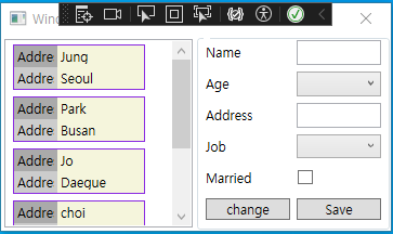
◾ ListBox 바인딩 - 멀티바인딩
- 목록 표시 형태를 어떻게 했는지 잘 보고 구현해야함
     ...
   <!-- 리소스 태그 정의 -->
    <Window.Resources>
        <DataTemplate x:Key="listteamplate">
            <Border Margin="1" BorderBrush="BlueViolet" BorderThickness="1">
                <Grid Height="40" Width="120">
                    <Grid.RowDefinitions>
                        <RowDefinition/>
                        <RowDefinition/>
                    </Grid.RowDefinitions>
                    <Grid.ColumnDefinitions>
                        <ColumnDefinition Width="40"/>
                        <ColumnDefinition/>
                    </Grid.ColumnDefinitions>
                    <Border Grid.Column="0" Grid.Row="0" Background="#FFAAAAAA">
                        <TextBlock Text="Name" VerticalAlignment="Center" Margin="3"/>
                    </Border>
                    <Border Grid.Column="0" Grid.Row="1" Background="#FFCCCCCC">
                        <TextBlock Text="Address" VerticalAlignment="Center" Margin="3"/>
                    </Border>
                    <Border Grid.Column="1" Grid.Row="0" Background="Beige">
                        <TextBlock Text="{Binding Path=Name}" VerticalAlignment="Center" Margin="3"/>
                    </Border>
                    <Border Grid.Column="1" Grid.Row="1" Background="Beige">
                        <TextBlock Text="{Binding Address}" VerticalAlignment="Center" Margin="3"/>
                    </Border>
                </Grid>
            </Border>
        </DataTemplate>
    </Window.Resources>
    <Grid Height="180" Width="360">
        <Grid.ColumnDefinitions>
            <ColumnDefinition />
            <ColumnDefinition />
        </Grid.ColumnDefinitions>

        <ListBox Name="listbox" Grid.Row="0" Margin="3" ItemTemplate="{StaticResource listteamplate}"/>
      ...
Listview
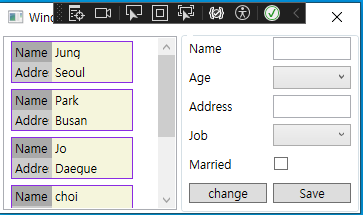
◾ Listview 바인딩 - 클래스 생성
- winform이나 MFC의 경우 ListView가 간단히/자세히/큰 아이콘/작은 아이콘과 같은 방식으로 선택 표시가 가능한 UI컨트롤이었으나 WPF에서는 상단에 헤더가 표시되는 '자세히' 방식만의 UI만 의미
- 다수의 정보가 컬럼을 통해 표시 되기 때문에 PersonInfo 클래스는 ListView에서만 표시하는데 이용하고, 별도로 PersonState 클래스를 하나 더 만들어서, 목록에 선택 했을 때 PersonState 클래스에 해당하는 정보가 표시되게 한다.
PersonInfo의 속성으로 PersonState형을 하나 추가한다.
    public class PersonInfo : INotifyPropertyChanged
    {
        private string name = null;
        private string address = null;
        private int age = 0;
        private int job = 0;
        private bool married = false;

        <!-- 객체 생성 -->
        private PersonState state = new PersonState();

       <!-- 생성자 생성 -->
        public PersonState State
        {
            get { return state;  }
            set
            {
                state = value;
                OnPropertyChanged("State");
            }
      ...

      public class PersonState : INotifyPropertyChanged
    {
        private int apps = 0;
        private int goals = 0;
        private int assists = 0;

        public int Apps
        {
            get { return apps; }
            set { apps = value; OnPropertyChanged("Apps"); }
        }

        public int Goals
        {
            get { return goals; }
            set { goals = value; OnPropertyChanged("Goals"); }
        }

        public int Assists
        {
            get { return assists; }
            set
            {
                assists = value;
                OnPropertyChanged("Assists");
            }
        }

        #region INotifyPropertyChanged Members

        public event PropertyChangedEventHandler? PropertyChanged;
        private void OnPropertyChanged(string propertyName)
        {
            if (PropertyChanged != null)
                PropertyChanged(this, new PropertyChangedEventArgs(propertyName));
        }
        #endregion
    }
◾ Listview 바인딩 - 데이터 생성
- ComboBox와 ListBox에서 사용한 데이터에 PersonState를 추가한다.
        public MainWindow()
        {
            InitializeComponent();

            #region Data추가 부분
            persons.Add(new PersonInfo { State = new PersonState { Apps = 32, Goals = 5, Assists = 2 }, Name = "Jung", Age = 0, Job = 1, Address = "Seoul", Married = true });
            persons.Add(new PersonInfo { State = new PersonState { Apps = 24, Goals = 11, Assists = 3 }, Name = "Park", Age = 3, Job = 0, Address = "Busan", Married = false });
            persons.Add(new PersonInfo { State = new PersonState { Apps = 18, Goals = 14, Assists = 1 }, Name = "Jo", Age = 2, Job = 2, Address = "Daegue", Married = false });
            persons.Add(new PersonInfo { State = new PersonState { Apps = 36, Goals = 8, Assists = 9 }, Name = "choi", Age = 1, Job = 1, Address = "Gwangjoo", Married = false });
            persons.Add(new PersonInfo { State = new PersonState { Apps = 27, Goals = 1, Assists = 6 }, Name = "Uh", Age = 2, Job = 2, Address = "Daejon", Married = true });

            listview.ItemsSource = persons;

            #endregion
◾ Listview 바인딩 - UI 만들기
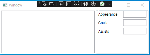
- XAML 코드에서 좌측에 ListView를 추가하고 우측에 TextBox와 TextBlock을 이용해 선택된 항목의 세부 정보 (PersonState)가 뜨도록 UI를 구성
	...

    <Grid Height="150" Width="500">
        <Grid.ColumnDefinitions>
            <ColumnDefinition />
            <ColumnDefinition Width="180"/>
        </Grid.ColumnDefinitions>

        <ListView Name="listview" Grid.Row="0" Margin="3"/>

        <GroupBox Grid.Column="1">
            <Grid>
                <Grid.ColumnDefinitions>
                    <ColumnDefinition />
                    <ColumnDefinition />
                </Grid.ColumnDefinitions>
                <Grid.RowDefinitions>
                    <RowDefinition/>
                    <RowDefinition/>
                    <RowDefinition/>
                    <RowDefinition/>
                    <RowDefinition/>
                </Grid.RowDefinitions>

                <TextBlock Grid.Column="0" Grid.Row="0" Text="Appearance" Margin="3" VerticalAlignment="Center" />
                <TextBlock Grid.Column="0" Grid.Row="1" Text="Goals" Margin="3" VerticalAlignment="Center" />
                <TextBlock Grid.Column="0" Grid.Row="2" Text="Assists" Margin="3" VerticalAlignment="Center" />

                <TextBox Grid.Column="1" Grid.Row="0" Margin="3" />
                <TextBox Grid.Column="1" Grid.Row="1" Margin="3" />
                <TextBox Grid.Column="1" Grid.Row="2" Margin="3" />

            </Grid>
        </GroupBox>
    </Grid>
◾ Listview 바인딩 - ItemsSource정의
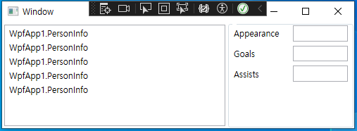
- ComboBox와 ListBox에서처럼 CS파일에서 정의를 하든 XAML에서 바인딩을 하든,, ItemsSource에 목록을 정의해놓고 실행하면 클래스명만 확인 된다.
◾ Listview 바인딩 - Header 정의
- XAML 코드에서 ListView의 View 속성에 GridView라는 태그를 정의해서 각 헤더별로 GridViewColumn을 이용해서 정의를 해 준다.
        <ListView Name="listview" Grid.Row="0" Margin="3">
            <ListView.View>
                <GridView>

                    <GridViewColumn Header="Name" Width="70"/>
                    <GridViewColumn Header="Address" Width="80"/>
                    <GridViewColumn Header="Married" Width="600"/>
                    <GridViewColumn Header="Age" Width="40"/>

                </GridView>

</ListView.View> 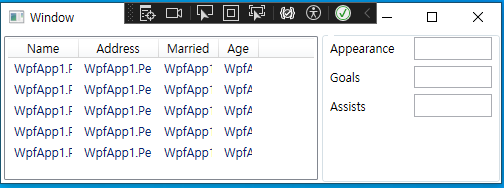
◾ Listview 바인딩 - Header Template 만들기
- GridViewColumn의 CellTemplate을 정의하면 되며 CellTemplate 하위에 DataTemplate 태그를 넣을 수 있고, DataTemplate 하위에 원하는대로 모양을 만들어주면된다.
→ TextBox나 CheckBox 등을 이용해서 내에서 수정을 하게되면 기본적으로 바인딩은 Two-Way로 동작하기 때문에 내부 목록의 항목 또한 동일하게 수정된다.
        <ListView Name="listview" Grid.Row="0" Margin="3">
            <ListView.View>
                <GridView>

                    <GridViewColumn Header="Name" Width="70">
                        <GridViewColumn.CellTemplate>
                            <DataTemplate>
                            <TextBlock Text="{Binding Name}"/>
                            </DataTemplate>
                        </GridViewColumn.CellTemplate>
                    </GridViewColumn>

                    <GridViewColumn Header="Address" Width="80">
                        <GridViewColumn.CellTemplate>
                            <DataTemplate>
                                <CheckBox IsChecked="{Binding Address}"/>
                            </DataTemplate>
                        </GridViewColumn.CellTemplate>
                    </GridViewColumn>

                    <GridViewColumn Header="Married" Width="60">
                        <GridViewColumn.CellTemplate>
                            <DataTemplate>
                                <TextBlock Text="{Binding Married}"/>
                            </DataTemplate>
                        </GridViewColumn.CellTemplate>
                    </GridViewColumn>

                    <GridViewColumn Header="Age" Width="40">
                        <GridViewColumn.CellTemplate>
                            <DataTemplate>
                                <TextBlock Text="{Binding Age}"/>
                            </DataTemplate>
                        </GridViewColumn.CellTemplate>
                    </GridViewColumn>

                </GridView>

            </ListView.View>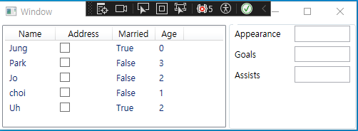
◾ Listview 바인딩 - SelectedItem 바인딩
- 정보를 선택했을 때, SeletedItem을 이용해서 바인딩 하는 방법
        <GroupBox Grid.Column="1">
            <Grid DataContext="{Binding ElementName=listview, Path=SelectedItem}">
                <Grid.ColumnDefinitions>
                    <ColumnDefinition />
                    <ColumnDefinition />
                </Grid.ColumnDefinitions>
                <Grid.RowDefinitions>
                    <RowDefinition/>
                    <RowDefinition/>
                    <RowDefinition/>
                    <RowDefinition/>
                    <RowDefinition/>
                </Grid.RowDefinitions>

                <TextBlock Grid.Column="0" Grid.Row="0" Text="Appearance" Margin="3" VerticalAlignment="Center" />
                <TextBlock Grid.Column="0" Grid.Row="1" Text="Goals" Margin="3" VerticalAlignment="Center" />
                <TextBlock Grid.Column="0" Grid.Row="2" Text="Assists" Margin="3" VerticalAlignment="Center" />

                <TextBox Grid.Column="1" Grid.Row="0" Text="{Binding State.Apps}" Margin="3" />
                <TextBox Grid.Column="1" Grid.Row="1" Text="{Binding State.Goals}" Margin="3" />
                <TextBox Grid.Column="1" Grid.Row="2" Text="{Binding State.Assists}" Margin="3" />

            </Grid>
        </GroupBox>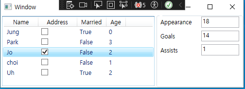
→ (.)을 이용해서 PersonInfo 클래스의 State속성에 접근하여 다시 State의 클래스인 PersonState의 Apps속성에 접근