[C# WPF] UI 만들기 #02 - WPF컨트롤, 공통 속성, 속성, 컨트롤 변경
1. WPF 컨트롤
- Winform에서 제공하는 Button, textbox, Combobox, CheckBox, RadioButton 등과 같은 기본적인 컨트롤 모두 지원
- WPF 컨트롤의 종류 : TextBlock, InkCanvas, WindowsFormsHost 등
순수 UI용 컨트롤 종류 : Border, Rectangle, Ellipse, Line 등
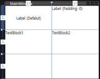
◾ TextBlock
- label 컨트롤 기능과 동일. UI상에서 단순 텍스트 표시
- 모든 컨트롤에서 Text를 표시하기 위한 가장 기본적인 컨트롤
- label 보다 TextBlock 이 더 다루기 쉽다.
    <Grid>

        <Grid.RowDefinitions>
            <RowDefinition/>
            <RowDefinition/>
            <RowDefinition/>
        </Grid.RowDefinitions>
        <Grid.ColumnDefinitions>
            <ColumnDefinition/>
            <ColumnDefinition/>
        </Grid.ColumnDefinitions>
        <Label Content="Label (Defalut)" Grid.Row="0" HorizontalAlignment="Center" VerticalAlignment="Center"/>
        <TextBlock Grid.Row="1" Text="TextBlock1" />

        <Label Content="Label (Padding :0)" Padding="0" Grid.Row="0" Grid.Column="1"/>
        <TextBlock Grid.Row="1" Grid.Column="1" Text="TextBlock2" />

    </Grid>
◾ InkCanvas

    <Grid>
        <InkCanvas/>
    </Grid>
◾ WindowsFormsHost
- WindowsFormHost : Winform으로 만들어진 유저 컨트롤을 WPF상에 올리기 위해 사용하는 컨트롤
액티브X의 경우 Winform에 올려 유저 컨트롤로 만든 다음 WPF의 WindowsFormsHost를 통해서 유저컨트롤을 가져온다.
    <Border x:Name="winFormHoest1Border" Grid.Column="0" BorderBrush="Yellow" BorderThickness="0">
        <my:WindowsFormsHost Name="windowsFormsHost1" />
    </Border>
    <GridSplitter Grid.Column="1" Name="verticalGridSplitter" Grid.RowSpan="3" HorizontalAlignment="Center">
        <my:WindowsFormsHost Name="windowsFormsHost2" />
    </GridSplitter>
→ 위코드는 ECDIS에서 C-Map 해도 모듈을 올리기 위해 사용한 부분
2개의 해도 컨트롤을 올리기 위해 WindowsFormsHost를 XAML 파일에 추가
→ WindowsFormsHost는 100% XAML 코드만으로 구현이 되지 않는다.
그래서 XAML 코드 상 Name 속성을 지정해서 XAML에 딸린 CS파일에서 사용 가능하도록 해야한다.
그리고 CS파일로 이동해서 XAML에서 추가한 WindowsFormsHost의 Child로 올리고자 하는 대상을 지정해준ㄷ.
일반적으로 올리고자 하는 유저 컨트롤 클래스의 객체를 만들어 지정해 주면 된다.
    <!--올리고자 하는 유저 컨트롤 클래스의 객체를 만들어 지정 -->
    windowsFormHost3.Child = new SHIUserControl();

    this.windowsFormHost1.Child = chartchiefManager.CreateChartControl(TypeChartT.CMAP);
this.windowsFormHost2.Child = chartchiefManager.CreateChartControl(TypeChartT.CMAP);- child : 컨트롤 내부에 존재하는 또 하나의 컨트롤
- 내부 컨트롤의 Parent : 내부 컨트롤을 가지고 있는 상위 컨트롤
◾ Border
- 사각 영역을 그리는 컨트롤
- 일반적인 배경색, 경계색, 두께 등이 지정 가능
- CornerRadius : 가장자리를 둥글게 표현 가능
- 다른 컨트롤과는 달리 Contentpreseter를 포함하고 있어 하위에 컨트롤 추가 가능
    <Border Grid.Row="0" Margin="5" BorderThickness="1" BorderBrush="Black" Background="Red" CornerRadius="10">
        <TextBox Text="border" Margin="30" />
    </Border>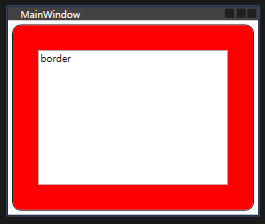
- 예를들어 단순하게 텍스트만 표시해야 되는 부분을 포장하기 위해, 외곽선과 배경을 주는 경우 TextBox로 만들게되면 읽기 전용 속성이나 포커스 해제 속성을 줘야하는 등 손이 많이 가지만 Border와 TextBlock을 이용해서 구성하는 경우 실행속도도 빠르고 괜찮은 UI를 생성 가능하다.
◾ Rectangle
- 사각 영역을 그리는 컨트롤, 단 ConerRadious 지정 불가
배경, 경계 등의 속성을 지정하는 속성 이름이 Border와 다르다.
ex) 배경색 지정 하는 경우
Border : Background
Rectangle : Fill
ex2) 경계색 지정 하는 경우
Border : BoderBruch
Rectangle : Stroke
◾ Ellipse
- 타원을 그리는 컨트롤
- 배경색, 경계선 등 설정 가능 (속성 명칭은 Rectangle과 동일)
Rectangle과 Ellipse는 Border와 달리 하위에 컨트롤을 둘 수 없다
부득이하게 이미지 위에 다른 컨트롤이 올라가야한다면 동일 위치에 나중에 써줌으로써 덮어버리는 방법을 사용해야 한다.
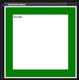
    <Grid Height="300" Width="300">
        <Rectangle Grid.Row="1" Margin="5" StrokeThickness="1" Stroke="Black" Fill="Green" />
        <TextBox Text="Border" Margin="35" Grid.Row="1" />
    </Grid>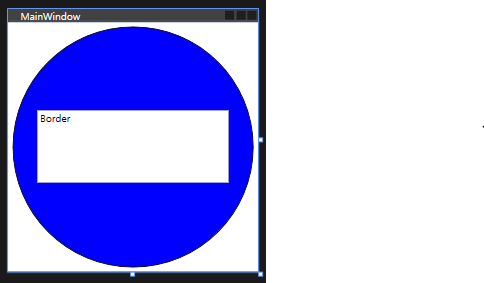
    <Grid Height="300" Width="300">
        <Ellipse Grid.Row="2" Margin="5" StrokeThickness="1" Stroke="Black" Fill="Blue" />
        <TextBox Text="Border" Margin="35,106,35,106" />
    </Grid>
◾ Line
- 시작점과 끝점을 속성을 통해 입력해서 선을 그리는 컨트롤
- 여러 Panel 컨트롤에서도 동일하게 동작하지만 Canvas에서 이용하는것이 가장 편함
◾ Path
- 점 들의 목록을 입력해서 점을 잇는 라인을 그리는 컨트롤
점과 점 사이를 직선으로 잇거나 커브를 그리며 이을 수 있다. - 실제 WPF에서 XAML 코드를 이용해 그림을 그릴 떄 자로 사용
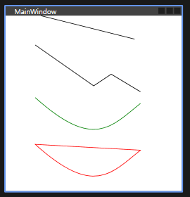
    <Canvas Height="300" Width="200">

        <Line X1="10" X2="170" Y2="40" Stroke="Black" StrokeThickness="1" />
        <Path Data="M0, 50 L 100, 120 130, 100 180, 130" StrokeThickness="1" Stroke="Black"/>
        <Path Data="M0 50 C 100, 140 130, 100 180, 60" Canvas.Top="90" StrokeThickness="1" Stroke="Green"/>
        <Path Data="M0 50 C 100, 140 130, 100 180, 60 Z" Canvas.Top="170" StrokeThickness="1" Stroke="Red"/>

    </Canvas>
2. WPF 컨트롤 공통 속성
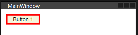
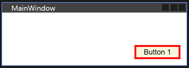
    <Button
        Height="23"
        Width="75"
        HorizontalAlignment="Left"
        VerticalAlignment="Top"
        Margin="12, 12, 0, 0"
        Padding="1, 1, 1, 1"
        Background="Beige"
        Foreground="Black"
        BorderBrush="Red"
        BorderThickness="3"
        FontFamily="Arial"
        FontSize="12"
        FontWeight="Normal"
        Content="Button 1"
        IsEnabled="True"
        Name="Button1"
        >

    </Button>
◾ Height / Width
- 컨트롤의 Height와 Width를 지정하는 속성
- Margin등의 속성만으로도 Height와 Width 없이 간접적으로 지정 가능
◾ HorizontalAlignment / VerticalAlignment
- 컨트롤을 가로 또는 세로 방향으로 정렬하는 방식
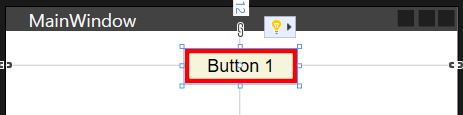
    <Button
        Height="23"
        Width="75"
        HorizontalAlignment="Center"
        VerticalAlignment="Top"
        ...
    <Button
        Height="23"
        Width="75"
        HorizontalAlignment="Left"
        VerticalAlignment="Bottom"
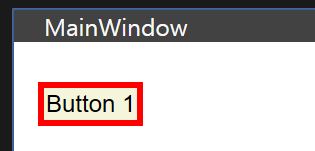
◾ Margin / Padding
- margin : Panel 컨트롤에서 얼마나 띄울 것이냐를 설정
- padding : 컨트롤 내부의 Content를 컨트롤 외곽라인을 기준으로 얼마나 띄울 것이냐를 설정
- 좌측, 상단, 우측, 하단 순서로 수치 입력, 동일할 때에는 하나만 입력
◾ Margin 과 Width, HorizontalAlignment / VerticalAlignment
- 잦은 레이아웃 변경 작업이 일어나는 경우 Margin으로 크기를 간접적으로 지정해주는 방식이 편하다
예 ) Grid 컨트롤을 이용해 가로 80 세로 30인 셀을 만들고 안에 컨트롤 배치 후 margin을 5로 주게 되면 알아서 가로 70 세로 20으로 크기가 결정됨 - 만약 Margin과 컨트롤의 크기를 둘 다 설정하게되면 직접 입력된 크기가 컨트롤의 절대 크기가 된다. → Margin은 정렬 속성과 맞물려 동작

    <Button
        Height="23"
        Width="75"
        HorizontalAlignment="Left"
        VerticalAlignment="Top"
Margin="12, 20, 10, 10"- 가로 정렬이 좌, 세로 정렬이 상인 경우 Margin 의 좌, 상 항목으로만 적용
만약 Height, Width가 지정되지 않으면 Margin의 우하 항목에 해당하는 만큼 컨트롤의 크기가 변경된다.
    <Button
        Height="23"
        Width="75"
        HorizontalAlignment="Right"
        VerticalAlignment="Bottom"
Margin="50, 20, 10, 10"- 가로 정렬이 우, 세로 정렬이 하로 된 경우 Margin의 우, 하 항목만 적용
3. WPF 컨트롤 속성
◾ 색상 관련 속성
- 변경 가능한 색상의 종료 : 배경(Background), 글자(Foreground), 경계색(BorderBrush)
- 경우에 따라 Fill, Strock 사용
- 컬러명을 직접 넣거나 (Red, Blue 등) ARGB 값 입력 (##FF3E232)
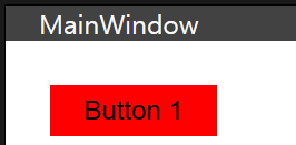
    <Button
        ...
        Background="Red"
        Foreground="Black"
        BorderBrush="Red"
        ...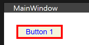
    <Button
        ...
        Background="Beige"
        Foreground="Blue"
        BorderBrush="Red"
        ...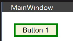
    <Button
        ...
        Background="Beige"
        Foreground="Black"
        BorderBrush="Green"
        ...
◾ 폰트 관련 속성
- 폰트 종류 (FontFamily), 크기(FontSize), 두께 설정 가능(FontWeight)
◾ Content / Text 속성
- Button이나 TextBox 같은 컨트롤에서는 문자를 컨트롤 안에 표시 가능
- Buton, CheckBox, RedioButton, Label TextBox 등 : 안에 들어가는 문자를 Content 속성으로 넣을 수 있다.
- TextBox, TextBlock : Text 속성으로 넣어줘야 함.
→ Content 속성의 경우 다양한 컨트롤을 넣을 수 있으나 Text 속성은 Text(TextElement 컨트롤)만 넣을 수 있다.
🔸 XML을 통해 Content나 Text 속성을 지정하는 방법
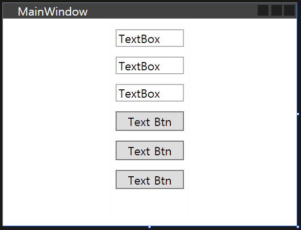
   <StackPanel Height="200" Width="80">

		<!-- 주로 사용 하는 방법 -->
        <TextBox Margin="5" Text="TextBox"></TextBox>

        <!-- Content를 이용해 컨트롤 내부에 또 다른 컨트롤을 넣고 싶을 경우 -->
        <TextBox Margin="5" > TextBox</TextBox>

        <!-- 바인딩 하는 경우 -->
        <TextBox Margin="5" >
            <TextBox.Text>
                TextBox
            </TextBox.Text>
        </TextBox>

        <Button Margin="5" Content="Text Btn"></Button>

        <Button Margin="5">Text Btn</Button>

        <Button Margin="5">
            <Button.Content>
                Text Btn
            </Button.Content>

        </Button>

    </StackPanel>
◾ ISEnabled / ISChecked / IsReadOnly / Focusable 속성
- ISEnabled : 모든 컨트롤에 적용, 컨트롤의 활성화 유무 설정 (True / False)
- ISChecked : CheckBox나 RadioButton, Toggle Button 같은 컨트롤에서 체크 선택 여부 설정
- IsReadOnly : TextBox에서 사용. TextBox 내 텍스트를 읽기 전용으로 설정
- Focusable : 모든 컨트롤에 적용. 컨트롤 자체에 포커스를 줄 수 있는지(선택 할 수 있는지) 여부를 설정하는 속성
윈도우 탐색기 등을 열고 Tab키를 누르면 탐색기 내 메뉴가 점선으로 표시되어 이동 → 점선 표시가 되는 것 = 포커스 됐다는 뜻
🔸 Focusable와 IsEnabled, IsReadOnly
- Focusable의 동작이 IsEnabled, IsReadOnly와 유사하나 차이점이 있음.
- 활성화 (IsEnabled)가 되지 않은 button은 누를 수 조차 없으나
포커스를 줄 수 없는 (Focusable) 버튼은 누를 수는 있다. - 읽기 전용인 (IsReadOnly) TextBox의 텍스트는 선택 가능하지만
포커스를 줄 수 없는 (Focusable) TextBox는 선택이 불가능하다.

    <StackPanel Height="200" Width="80">

        <TextBox Margin="5" Text="TextBox"></TextBox>

        <TextBox Margin="5" Text="TextBox" IsReadOnly="True"> </TextBox>

        <TextBox Margin="5" Text="TextBox" IsEnabled="False"></TextBox>

        <TextBox Margin="5" Text="TextBox" Focusable="False"></TextBox>

        <CheckBox Margin="5" Content="check"> </CheckBox>
        <CheckBox Margin="5" Content="check" IsChecked="True"> </CheckBox>
    </StackPanel>
→ TextBox에 IsReadOnly True 설정 시 문자를 선택하거나 복사 할 수 있지만 수정/삭제 불가
→ TextBox에 IsReadOnly false 설정 시 비활성화되어 선택/수정 불가 및 이벤트 미동작
→ Focusable 이 false 가 되면 선택/수정 불가하지만 활성화 되어 있어 보이지는 않더라도 마우스 클릭 같은 각종 이벤트들은 동작
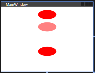
◾ Opacity / OpacityMask
- 투명도와 관련된 속성
- Opacity : 컨트롤 자체의 투명도 설정
- OpacityMask : 컨트롤 위에 덮어버리는 창 수정이 불가능한 이미지 파일을 가지고 작업 시 유용하게 사용되지만 Opacity 속성만으로 유사한 효과를 낼 수 있다.

    <StackPanel Height="200" Width="80">

        <Ellipse Opacity="1" Fill=" red" Width="60" Height="30" Margin="5"></Ellipse>
        <Ellipse Opacity="0.5" Fill=" red" Width="60" Height="30" Margin="5"></Ellipse>
        <Ellipse Opacity="0" Fill=" red" Width="60" Height="30" Margin="5"></Ellipse>
        <Ellipse Visibility="Hidden" Fill=" red" Width="60" Height="30" Margin="5"></Ellipse>
        <Ellipse Visibility="Visible" Fill=" red" Width="60" Height="30" Margin="5"></Ellipse>

    </StackPanel>
        <Ellipse Opacity="1" Fill=" red" Width="60" Height="30" Margin="5">
            <Ellipse.OpacityMask>
                <LinearGradientBrush StartPoint="0,0" EndPoint="0,1">
                    <GradientStop Color="#00FFFFFF" Offset="0"/>
                    <GradientStop Color="#FFFFFFFF" Offset="0.8"/>
                    <GradientStop Color="#55FFFFFF" Offset="1"/>
                </LinearGradientBrush>
            </Ellipse.OpacityMask>
        </Ellipse>
◾ Visibility
- Opacity와 비슷하나, 숫자가 아니라 Visible,Hidden,Collapse라는 문구로 설정
Visible : 화면에 표시
Hidden : 화면에서 없앤다.
Collapse : 컨트롤을 화면에서 없앨 때, 컨트롤이 가지고 있는 공간 영역(컨트롤 사이즈)도 없애는 속성

    <StackPanel Height="200" Width="80">
        <Ellipse Opacity="1" Fill=" red" Width="60" Height="30" Margin="5"></Ellipse>
        <Ellipse Opacity="0.5" Fill=" red" Width="60" Height="30" Margin="5"></Ellipse>
        <Ellipse Opacity="0" Fill=" red" Width="60" Height="30" Margin="5"></Ellipse>
        <Ellipse Visibility="Hidden" Fill=" red" Width="60" Height="30" Margin="5"></Ellipse>
        <Ellipse Visibility="Visible" Fill=" red" Width="60" Height="30" Margin="5"></Ellipse>
</StackPanel>- Hidden 으로 설정 시 화면에는 보이지 않지만 타원이 차지하고 있는 공간은 유지되고 있다.
    <StackPanel Height="200" Width="80">
        ...

        <!-- Collapsed 로 변경 -->
        <Ellipse Visibility="Collapsed" Fill=" red" Width="60" Height="30" Margin="5"></Ellipse>

        ...
    </StackPanel>
세 번째 Ellipse를 Collapsed로 경하는 경우, 아래의 원이 위로 올라와서 표시된다.
StackPanel 처럼 컨트롤의 위치가 순서에 따라 상대적으로 변하는 패널 컨트롤에서만 볼 수 있는 현상임.
◾ 윈도우 속성
- 어플리케이션UI를 이루는 기본적인 윈도우, 창에 대한 속성
🔸 SizeToContent
- 윈도우도 Height나 Width를 통해 크기 입력이 가능하지만, 윈도우에 크기 설정을 하게 되면 경계선, 타이틀 바 등이 모두 포함된 크기라 실제 작업을 하는 내부 영역이 작아질 수 있기 때문에 내부의 최상위 Content에 크기 입력을 하고 윈도우는 SizeToContent를 WidtAndHeight 로 두게 되면 위도우 크기가 Content에 딱 맞게 맞춰진다.
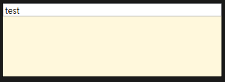
<Window x:Class="WpfApp1.MainWindow"
        xmlns="http://schemas.microsoft.com/winfx/2006/xaml/presentation"
        xmlns:x="http://schemas.microsoft.com/winfx/2006/xaml"
        xmlns:d="http://schemas.microsoft.com/expression/blend/2008"
        xmlns:mc="http://schemas.openxmlformats.org/markup-compatibility/2006"
        xmlns:local="clr-namespace:WpfApp1"
        mc:Ignorable="d"
        Title="MainWindow"
        SizeToContent="WidthAndHeight"
        AllowsTransparency="True"
        WindowStyle="None"
        ResizeMode="NoResize"
        Background="Cornsilk"
        >

    <StackPanel Height="100" Width="300">
        <TextBox x:Name="textbox" Text="test" RenderTransformOrigin="0.511,-1.787"/>
    </StackPanel>
</Window>
🔸 ShowInTaskbar
- 윈도우가 뜨면 하단 작업 표시줄에 해당 윈도우가 표시되는 것을보이게 할지말지 설정
- false 로 하면 작업표시줄에 표시가 되지 않는다.
🔸 WindowStlye
- None 선택 시 테두리/타이틀 바가 없는 순수한 Content 영역만 표시된다.
🔸 AllopTransparency
- 윈도우 자체에 투명도를 허용할 지 설정
- True로 설정 시 윈도우도 배경색 지정 할 수 있는데, 이 때 배경을 투명(Transparent)나 투명도를 줬을 때, 투명한 윈도우가 만들어진다.
- 이 속성을 위해서는 반드시 WindowStyle 속성이 None으로 되어있어야 한다.
🔸 Resize
- None 선택 시 테두리/타이틀 바가 없는 순수한 Content 영역만 표시된다.
◾ 컨트롤 변경
- 개별 컨트롤들은 Transform을 통해 형태 변경 가능
ex) Button 하위에 RenderTransform 이라는 속성을 정의하면 하위에 여러개의 Transform을 볼 수 있다. - ScaleTransform : 컨트롤의 크기 변경. (ScaleX, ScaleY를 통해 변환)
CenterX와 CenterY는 변환의 기준점 - RotateTransform : 컨트롤 회전 (Angle을 통해 각도 조절)
CneterX와 CenterY를 통해 중심축 설정 - SkewTransform : X,Y 방향으로 컨트롤의 형태를 기울임
AngleX와 AngleY를 통해 설정
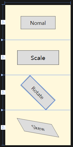
    <Grid Height="320" Width="150">

        <Grid.RowDefinitions>
            <RowDefinition/>
            <RowDefinition/>
            <RowDefinition/>
            <RowDefinition/>
        </Grid.RowDefinitions>

        <Button Grid.Row="0"  Height="30" Width="80" Content="Nomal">

        </Button>

        <Button Grid.Row="1"  Height="30" Width="80" Content="Scale">
            <Button.RenderTransform>
                <ScaleTransform ScaleX="1.2" ScaleY="1.1" CenterX="40" CenterY="15"/>
            </Button.RenderTransform>
        </Button>

        <Button Grid.Row="2"  Height="30" Width="80" Content="Rotate">
            <Button.RenderTransform>
                <RotateTransform Angle="45" CenterX="40" CenterY="15" />
            </Button.RenderTransform>
        </Button>

        <Button Grid.Row="3"  Height="30" Width="80" Content="Skew">
            <Button.RenderTransform>
                <SkewTransform AngleX="30" AngleY="10" CenterX="40" CenterY="15" />
            </Button.RenderTransform>
        </Button>
    </Grid>
🔸 RanderTransform VS LayoutTransform
- RanderTransform : 컨트롤이 화면상에 그려지는 형태만 변형
- LayoutTransform " 컨트롤이 차지하고있는 Layout 즉 공간 자체를 변형
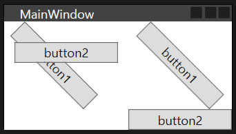
    <StackPanel Orientation="Horizontal">
        <StackPanel>
            <!--- Button.RenderTransform -->
            <Button RenderTransformOrigin="0,0" Margin="20, 0, 0, 0" Width="100">
                <Button.RenderTransform>
                    <RotateTransform Angle="45"/>
                </Button.RenderTransform>
                button1
            </Button>
            <Button Width="100">button2</Button>
        </StackPanel>

        <StackPanel>
            <Button Width="100">
                <!--- Button.LayoutTransform -->
                <Button.LayoutTransform>
                    <RotateTransform Angle="45"/>
                </Button.LayoutTransform>
                button1
            </Button>
            <Button Width="100">button2</Button>
        </StackPanel>
    </StackPanel>
→ RenderTransform 이 사용된 결과는 버튼이 겹친다.
원래 StackPanel은 컨트롤이 겹치지 않게 쌓아주는 Panel이기 떄문에 겹칠 수 없다.
즉, 겹쳤다는 것은 RenderTransform에 의해 그려지는 형태만 변경이 되었지 컨트롤이 차지하고 있는 공간은 그대로라는 말이다.
→ 일반적으로는 RenderTransform만 사용하면 큰 문제는 없으나 경우에 따라 LayoutTransform을 사용하게 되는 경우도 생긴다.